
 What Colours Are Best for My Vinyl Banner or Sign
Choosing colours for your banner is another one of those tasks that is easier said than done.
Knowing which colours to use on your banner to achieve the desired result can be difficult (Designers work hard for their pay :).
The balance between being easy to see, easy to read, as well as being a design engaging enough to draw attention to your vinyl sign in the first place.
If your banner is for a special occasion, a wedding or birthday, the colour issues are not a problem. You can have whichever colours work best for your occasion. Clarity is less of a concern in this case and making your banner right for the person or people involved is far more important.
 On the other hand should you be in business or part of an organisation, you want your banner to work hard for you. More business, new members, more parishioners on seats, these banners have a specific job to do and must be sharpened to make sure they are as effective as we can make them.
The best colours to use for your vinyl signs I’ll discuss here, are based purely on legibility and clarity.
I understand there can be corporate colours and branding you may have to consider for your banners. This information will help you choose your banner colours within these constraints, and make sure they work.
The Colour Basics
The ease with which we can read anything is a result of the difference in the refractive index of the colour of the background, opposed to the colour of your text. The greater the difference in the index of the colours, the more apparent contrast we see. This makes the text easier to see,
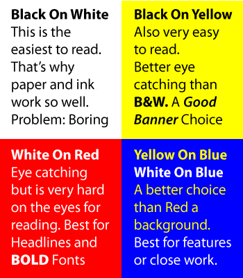
 The colour refractive index best suited for us to read is 100 The scale we are using is measured in units from 0 to 100. You can likely guess which two colours give us the best result – you guessed it. Black on white, I know these aren’t really colours but you take my point :). White comes in with a score of one hundred, while black is zero.
White obviously is the most reflective, it returns almost all of the light reaching it back to the environment. While black on the other hand drinks light in like a sponge absorbing almost all the light that reaches it. Ever worn a black t-shirt on a sunny day? Same thing, this is why black on white is the easiest to read.
Based on this then, all our banners should be black on white, not so. The problem with this is? Black and white are Boring.
Black on white is great for the morning paper, beaut for typing an email but dead boring when it comes to catching someone’s attention to your sign.
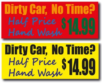
The colour combination I most often resort to for my own vinyl banners is Black on Yellow. These two colours have a refractive index difference of about 70, so still easy on the eyes from a reading perspective.
Black on Yellow though is far more interesting, and more importantly, more eye catching than plain old black on white. Think of all those road works signs. Most of them are Black on Yellow, why?
Because Black on Yellow gets seen. Have a look next time you are driving, look for the signs that stand out.
 To place this in perspective colours like Blue and Red have a very a similar refractive indexes and as such are very hard to read used together, using these types of colours should be avoided if you can.
Apart from the actual colours themselves, another factor to consider when choosing colours for any signage is the level of colour saturation or brightness used.
Bright colours are seen more easily, Reds, yellows, blues and greens all stand out well when at the bright or saturated end of the colour scale. Bright colours are pure colours and reflect a single wavelength (or narrow band) of light.
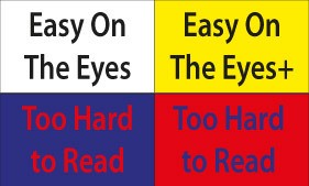
Bright colours though cause visual fatigue. The reason for this is because your eyes must keep refocusing on different light wavelengths being used. Your eyes work harder to look at it. Look at the red and blue examples here.
That said, your prospects don’t have to read your banners all day.
So judicious use of bright colours to attract more attention is fine, a bold headline on your banner is a great place for this. Balance that with some softer tones. This end of the colour scale is called the Gray end.
Even pastels work in the right combinations. The correct colours for your secondary text and the background ensure your message is easy to look at, and read. Look for a balance between eye catching colour and easy legibility. I also recommend keeping the number of colours to a minimum in your design, three to four as a rule of thumb.
The best way to show these concepts are with examples. I hope this info and the information provided help you to choose effective colours for your next outdoor sign or vinyl banner.
Cheers
Steve – The Vinyl Banner Guy
PS. You can download a summary of this information by clicking here
Vinyl Banner Colour Guide